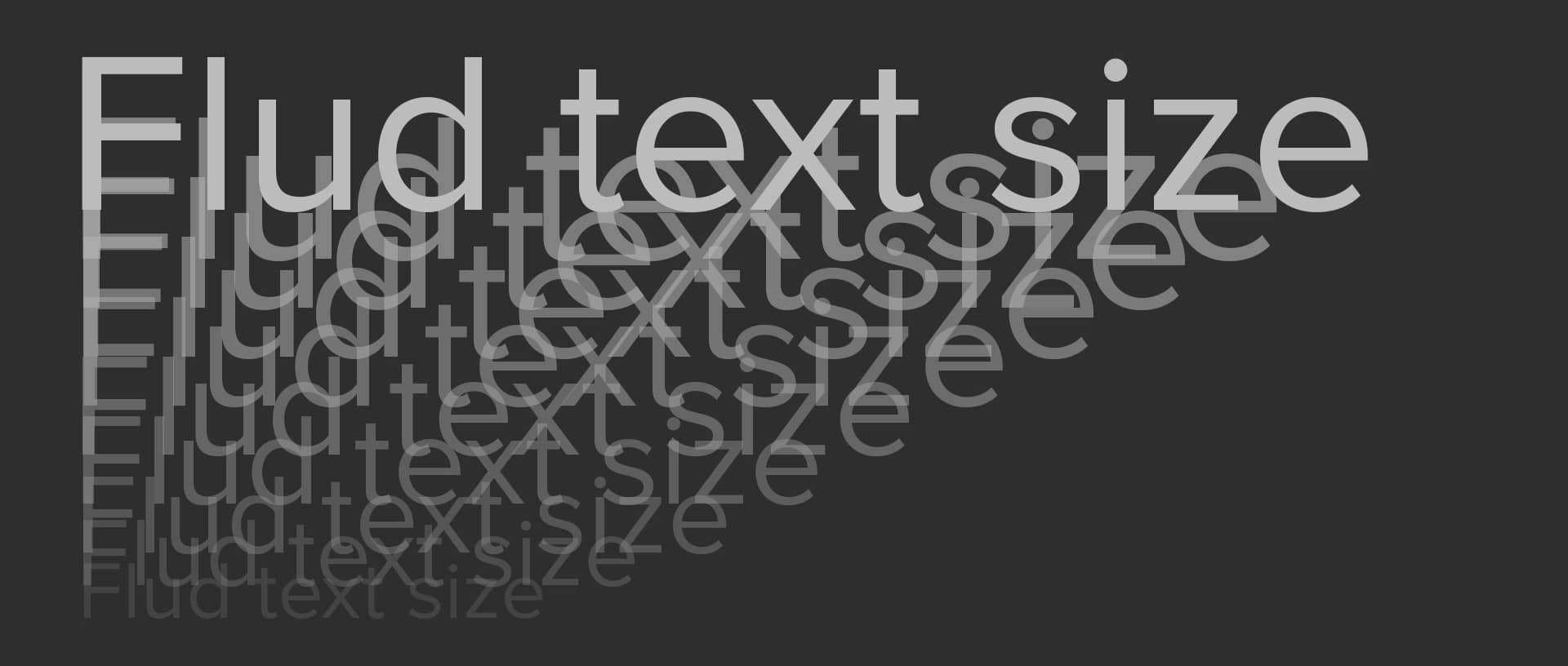
CSS trick: Fluid text size with “max-font-size” and “min-font-size”
UPDATE:
font-size: clamp(10px, 12px + .8vw, 50px);
This sets the font-size to minimum 10px, maximum 50px, or else the font-size is set to 12px + .8vw.
OLD ARTICLE:
It’s not news that you can use the vw (view width) measurement on font-size to get the size of the font fluid based on the width of the browser width.
But a problem with this is to make sure the font don’t get to big or to small.
One way to do it is to use media query’s on both the minimum and maximum size, like this:
body{ font-size:1.4vw; }

@media screen and (min-width:1600px) {
	body{ font-size: 26px; }
}

@media screen and (max-width:575px) {
	body{ font-size: 12px; }
}
But i have found that using calc() on the font-size you can remove the minimum size query:
body{ font-size:calc(12px + .8vw); }

@media screen and (min-width:1600px) {
	body{ font-size: 26px; }
}
Here the size of the font will never get smaller than 12px.
(For rest of the font sizes i use em)
In this example i use a container with max width 1600px. Thats why i stop the font from “growing” after 1600px browser width.
Extra tip:
Set the font-size on the HTML-tag and use rem on all other measurements, padding, margins, widths and other sizes to get the same fluid feel. Eg. margin-top:calc((1rem – 10px) * 10); if body font-size is 16px this will add up to 60px. Then these measurements also will get the minimum and maximum values based on the font-size;